Every designer, marketer, and small business owner knows the stress of comparing vibrant screen colors to a finished print, hoping the match is perfect. Clients expect what they see on their devices will show up exactly the same in print — but that’s rarely what happens. These color differences aren’t just annoying; they can change the whole feel of a brand, a campaign, or a gallery piece.
Why do print colors look different from your screen? The short answer: screens emit light, printers apply ink — and those two processes handle color in fundamentally different ways. Understanding the gap between RGB and CMYK, and what you can do about it, is one of the most practical things you can learn before your next print project. From color modes and paper types to ink choices and proofing, a lot can change how your colors turn out. Getting a handle on these factors saves time, money, and frustration — and gets you much closer to the results you want.
The gap between screen colors and printed results comes down to how colors are built and displayed in different color spaces, each designed with a specific purpose. Understanding RGB, CMYK, and standards like LAB and Pantone helps you approach both digital designs and print jobs with confidence.

Photo by Enric Cruz López
Screens work like tiny stages, lighting up red, green, and blue pixels to create every color you see. This is called an additive color model — the more light you add, the brighter the color gets. When all three channels are at full brightness, you get pure white.
The result is a palette that often goes far beyond what any printer can reproduce.
Print is a different animal. Instead of mixing colored light, printers lay cyan, magenta, yellow, and black Print is a different process entirely. Instead of mixing colored light, printers layer cyan, magenta, yellow, and black inks onto paper. This subtractive process absorbs certain wavelengths of light and reflects whatever is left back to your eyes.
This is why it’s critical to start any print project in CMYK mode, or at minimum know which colors will be affected by conversion. Choosing the right printing materials for your project also plays a big role in how accurately colors reproduce.
Switching from RGB to CMYK can feel like losing the magic. What looks sharp and lively on your monitor may print muddy or flat.
Professionals address these challenges with a few proven tools: soft proofing to preview how colors will print before going to press; Pantone and spot colors for consistent, standardized results on critical brand colors; and device-independent spaces like LAB as a bridge for accurate color translation across different devices and materials.
Understanding specialty papers and custom inks can also make a significant difference — the substrate you print on directly affects how ink colors appear in the final piece.
Colors can trick us. What glows on your monitor often falls flat on paper, leaving out the rich tones and vibrant hues you saw on-screen. This is where soft proofing comes into play. It lets you see a digital preview of how your art, photo, or design will look in print, with the help of specialized software and some behind-the-scenes color science. While it doesn’t promise a perfect match, it gives you a much better shot at getting your prints right the first time.
Colors can trick us. What glows on your monitor often falls flat on paper. This is where soft proofing comes in — it lets you see a digital preview of how your artwork or design will look in print, using specialized software and color science. While it doesn’t guarantee a perfect match, it gives you a much better shot at getting it right the first time.
Soft proofing is like holding up a test print to your monitor — without wasting ink or paper. Image editing programs like Adobe Photoshop or Lightroom transform your image’s colors so your screen simulates what your printer and paper will actually produce.
For soft proofing to work reliably, you need two things:
Here’s how the process flows:
Soft proofing is a small time investment with a big payoff in print satisfaction.
Some colors fall outside what a printer’s ink can reproduce — they’re called “out of gamut.” Soft proofing tools flag these colors so you can fix them before they surprise you on paper.
Most editing programs offer a gamut warning feature that grays out colors your printer can’t hit. Once you know what’s out of range, you choose how to handle it using a rendering intent:
Test both on your specific image and go with the one that looks right to your eye.
Even with perfect calibration and profiles, screens can only get you close to the print — not identical. Screens use direct light; prints reflect light. That alone makes prints look flatter and less punchy than backlit displays. Add in ambient light in your workspace, paper texture and finish, and the limits of even pro-grade monitors, and you’ll always have some variance.
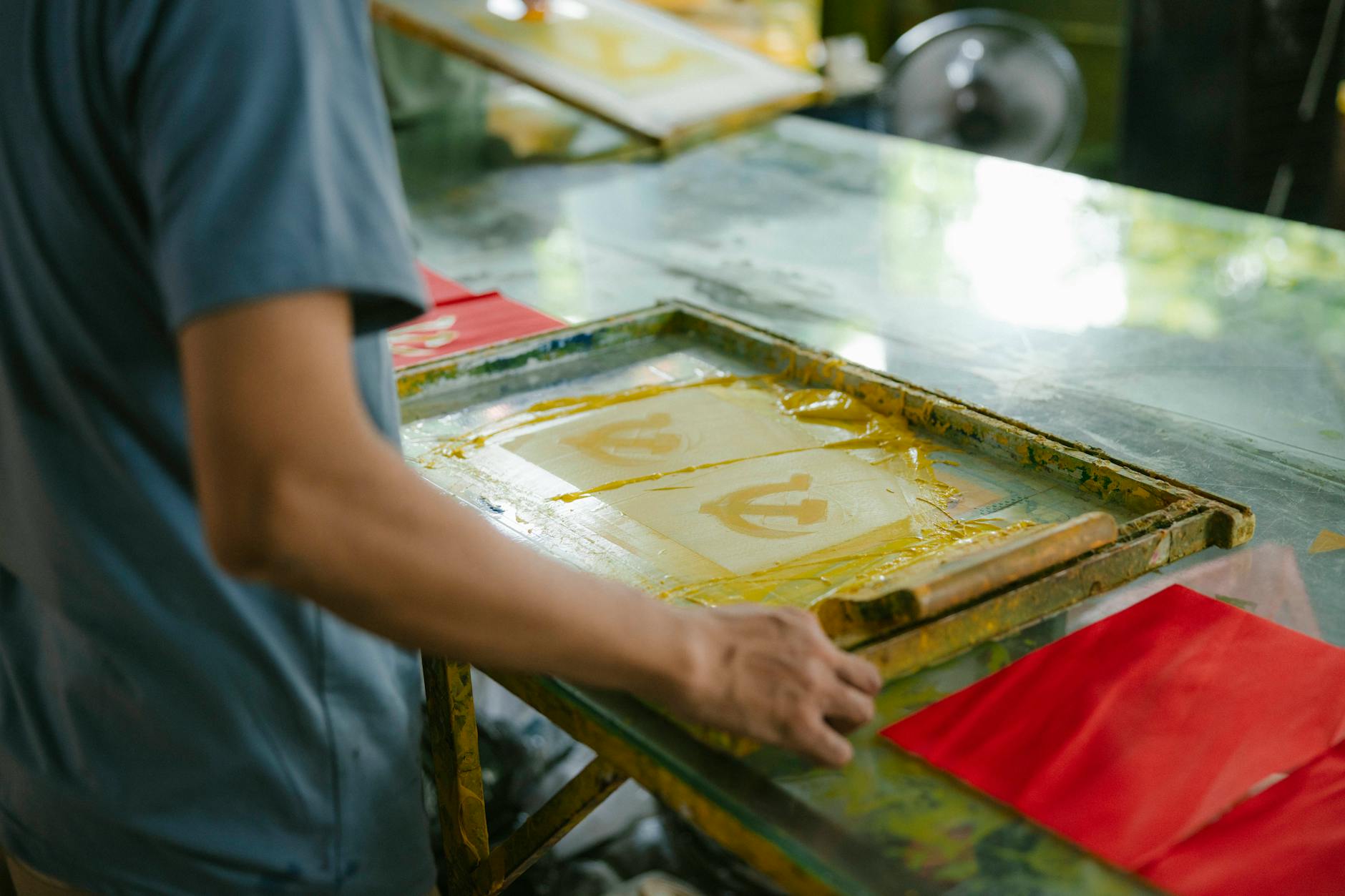
 Photo by Steve Johnson
Soft proofing is your best tool for predicting print results, but it isn’t a crystal ball. If color accuracy is critical, follow up with a hard proof — a physical test print — before running the full job.
When accuracy genuinely matters, you need ink on paper in front of you. Hard proofs are the backbone of quality assurance for brands, photographers, packaging designers, and anyone who cares deeply about how color lands in the real world.
Unlike a soft proof on your screen, a hard proof is a physical print made to simulate the final press output as closely as possible. It gives you a true sense of color, density, sharpness, and how your chosen substrate interacts with ink. Think of it as the dress rehearsal before the show.
Digital Proofs are made using high-end inkjet printers calibrated to simulate your final print process. They’re fast and cost-effective — ideal for checking color expectations, confirming layout, and getting approvals on short runs or less-critical materials.
Press Proofs are created on the actual press, using the same inks, plates, and substrate as the final run. More expensive and slower to produce, but for high-stakes jobs — packaging, corporate branding, art prints — nothing beats them for accuracy.
Both types catch problems that screen previews can’t, like how a subtle gradient behaves on uncoated stock, or whether a logo has enough contrast against a colored background.n’t—like how a subtle gradient will look on uncoated paper, or if a logo pops enough against a colored box.
 Photo by Jakub Zerdzicki
You’ve probably compared a proof to a press sheet and thought, “Close enough!” But color accuracy isn’t just a gut feeling. The print industry uses a metric called Delta E (ΔE) to measure the difference between a reference color and what lands on your page.
ΔE values mean colors are nearly identical. A ΔE of 2 or less is a near match to most eyes (only pros spot the difference), while anything around 3 or below passes as a close visual match. Beyond 5, the shift becomes clear even to non-experts.2 or less, or up to 3 for some less-critical applications. Premium brands, art books, and packaging often set hardline standards at ΔE ≤ 2. This matches ISO 12647-2 and similar industry standards, which define how print colors should be checked and how much swing in color is allowed from proof to finished product. Typical color tolerances:
ΔE ≤ 2: Preferred, almost indistinguishable to the human eyeΔE 2-3: Acceptable for most commercial print workΔE > 3: Noticeable difference, not generally accepted for color-critical jobsA hard proof paired with Delta E measurement isn’t just tradition—it’s how the world’s top brands lock down their colors, project after project, year after year.
Even when you prepare everything perfectly, color shifts can sneak in. These differences are rooted in file setup, printing equipment, materials, and even the environment where a press runs.
Getting your file ready for print means more than saving it in high-res. The smallest slip in color setup can change the whole look of your print.
What helps:

Photo by HONG SON
A print’s color can swing just by swapping out one ingredient or switching machines. Here are the key culprits:
Pro tip: Work with your print partner to get test prints on your final stock, with press calibration logs when available. This gives you a clearer idea of true-to-life results before approving a full run.
It’s easy to blame a printer or operator for color shifts, but sometimes it’s the invisible stuff in the room (or inside the machine) causing trouble.
Keep it running smooth by:
Every part of the process, from pixel to pressroom, has a chance to alter color. Knowing where these issues lurk helps prepare, pinpoint, and fix problems fast, so you keep your brand colors on target and your clients happy.
Matching your screen colors to your final print can feel like staring into two different worlds. The good news? With the right steps, you can close the gap and get predictable, trusted results. Here’s how designers and print buyers can optimize every stage, from screen adjustments to working with print shops.
 Photo by Arthur A
Clear communication with your printer prevents the most costly surprises. Whether you’re printing corporate materials or marketing collateral, the same principles apply.
If you’re working with an agency or managing print on behalf of clients, our wholesale printing for brokers program is built with color accuracy and reliable turnarounds in mind.
Screens use RGB (light-based color), while printers use CMYK (ink-based color). These two systems have different color ranges, and some vivid screen colors simply can’t be replicated with ink.
Design in CMYK from the start for any project going to print. If you must work in RGB, convert to CMYK early and use soft proofing to check for color shifts before sending files.
A color proof — either digital or physical — simulates how your final print will look. For anything involving brand colors, packaging, or high-volume runs, a proof is essential and far cheaper than reprinting.
Use the correct ICC profiles, calibrate your monitor regularly, soft proof before sending files, and communicate color tolerances with your printer. Choosing the right paper stock also makes a measurable difference.
Delta E (ΔE) measures the difference between a target color and the printed result. A ΔE of 2 or less is the standard for color-critical work — most people can’t detect the difference at that level.
Every print project deals with some color difference between screen and paper. That’s not a failure — it’s simply how color behaves when you move from glowing pixels to ink and substrate. Good results don’t come from luck; they come from process. Calibration, correct profiles, and regular proofing all narrow the gap so there are fewer surprises.
Whether you’re printing a brand campaign, product packaging, or business collateral, investing time in soft and hard proofs — and keeping open communication with your print partner — pays for itself every time.
Ready to get accurate, consistent color on your next project? Contact our team in Bensalem, PA — we serve Philadelphia, Princeton, Allentown, and the surrounding region with professional printing built around your brand standards.
Invest time in soft and hard proofs for work that matters and keep the conversation open with your print partner. When you take color seriously, your clients notice—and your projects look their best, every time. Thanks for reading. Share your toughest color story or best tip below and keep the learning going.
